Saturday, December 27, 2014

Interesting New Scrap Stuff


Something lovely I'm finding in the new releases, for the upcoming Craft and Hobby Association show in Anaheim, are Prima's color bloom sprays in delightful new shades of Impress Gold, Berry Wine, Boysenberry, Deep Teal and Yellow Mustard.
The Pima markers look intriguing, too. It will be interesting to see how they compare with alcohol markers currently popular in the market.
In fact, all of Prima's mixed Media products look very beautiful and intriguing and will surely merit a stop at their booth at CHA.
Today I purchased a set of papers from Studio Calico. Looks like they will be diving into Digi products full force. It will be interesting to see what develops in the digital scrapbook market this next year. I'm sure there will be lots to discuss on The Digiscrap Geek Podcast !
Christmas Day and Boxing Day were delightful fun with family and friends. Today is going to be quiet. So nice to look around on this third day of Christmas to a clean and decorated home and a peaceful weekend. I'll be getting the craft room in order and doing some financial year end matters and some relaxing.
Hope you are enjoying your end of the Christmas season. Thinking about resolutions for the New Year yet? Any new products or lines of craft products that have you intrigued?

Saturday, December 20, 2014

Just 12 Days scrap designs and a little art


Some Pocket Cards for a "Just 12 Days" Project

I'm pretty new to designing but I did want to play a little. The cards use the deep colors of the palette I chose. I am putting into play some of what I learned from Danielle Young's Pocket Pops 2 Adobe Illustrator Class and Pocket Pops 1 Adobe Illustrator Class at Scrapaneers. If I have time, I'll make a few more cards using more white with these colors as accents. It was a fun exercise. They are available as a free download at the link I've provided above.

It's been a great adventure over the past couple of years to begin to learn art and art new media. I've a long way to go in the process but I do enjoy exploring art and design. I overdid the last few months and my body is telling me to moderate my activity. It's been very enjoyable, nonetheless.

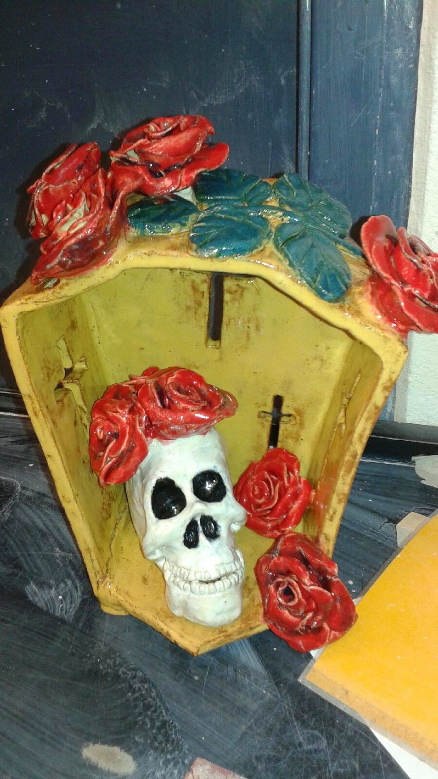
Here is the Dia de Los Muertos shrine project I made. I'm pretty proud of this and plan to learn more ceramics. I need help carrying the heavy pieces but find my fellow students and teacher willing to help. I like the way work can evolve slowly. I've found the loss of control a bit daunting. Clay and glazes do what they want. In student classes, things get broken, glazes drip on other pieces, colors do not turn out as expected. Happy accidents happen, too. This piece fortunately did come out as I envisioned it and I'm delighted to have it. I wish the colors of the glazes showed up better. This was a friend's cell phone photo. I'll see if I can get a better photo now that the piece is at home. I'll try to take photos of some of my other completed art and post that, too.


Hope you are enjoying the holiday season. Try not to overdo.


Tuesday, December 9, 2014

Some idea prompts for "Just 12 Days"


Just a quick post to let you know that I have been developing my seasonal album idea. I think I shall devote some time this coming year to put it all together in a package for next year. Meantime, I hope some of my brainstorming gives you some good ideas for making your own album. Remember you can go to places like The Graphics Fairy to get free clip art for your pages, as I did above.
Here are a list of 12 topics you might use for your album inspiration.
A Hanukkah/Christmas/Kwanzaa/Solstice memory

Just 12 Days:

New Year Resolutions
Seasonal Parties outside of home or special events like concerts attended
Special recipes
Holiday Decor
The weather
Family Traditions remembered and why I do or do not continue these
My favorite holiday book, song, movie, etc.
The news headlines this past year
Messages to a family member or members of to the world at large
Something I made - a craft project or art or a sweater I knit
A story about a special gift I gave or received

Sunday, December 7, 2014

Best Laid Plans

 Robbie Burns said:
But Mousie, thou art no thy lane,
In proving foresight may be vain:
The best-laid schemes o' mice an' men
Gang aft agley,
An' lea'e us nought but grief an' pain,
For promis'd joy!"
Like the poet says my plans do go astray. In this case, no grief and pain. Actually, a fair bit of joy!
 I took a little time to travel to Stockton on Saturday to check out a new craft product with Marion Smith. Spent time with Cal and enjoyed the winters landscape. 
Today I met with long time friends for lunch. The two couples, long time friends, have homes outside the state but also have places here and were in town. So, a spontaneous lunch date was planned. It was a wonderful time.
Still, a lot got done at my home with my son's help and I am feeling more prepared for Christmas. Not so sure that I am prepared for the big storm that is supposed to hit mid week. I hope no power outages. We do have a generator, just in case; but, really, Mother Nature, folk have plans!
I am busy with art but can only do so much. Too much and the pain is just too much; so, maybe a good thing that my routine was disrupted, though I'd planned a Crocker Museum visit today. Will need to get my visit there in before the storm.
No Scrapbooking nor designing and no progress in my Just 12 Days project. On the other hand, it is important to make the memories to record. I can always get to the project later and the advantage of just 12 Days is that "catching up" is no big deal.
Hope you are also busy making significant memories and that all nasty weather passes you by.


Friday, December 5, 2014

A Correct Analysis

Marsala is the color of the year for 2015. It was fun to see the guesses but my money was on Marsala all along. I did have the advantage of listening to the Pantone webinar when they released the palettes for the coming year.
I saw that Marsala, Toasted Almond and Classic Blue were the only colors shared in all three palettes - men's, women's and home decor.
The webinar referred to blue as a companion color and one that tinted other colors. Almond just seemed to be a nice neutral filling the bill, along with Glacier Gray, for an ethereal neutral, but did not embody the rich earthiness and warmth that Pantone felt was the direction of color.
So, Marsala was my prediction.
How do I feel about this color? I like it. It has been the brunt of many jokes because it can be associated with dried blood, overdone pasta sauce, and "wino"s. A similar hue which was more saturated and less shaded was popular about 25 years ago. By now, some of those vintage items might be faded and work pretty well. Bad jokes and vintage revival aside, I do like the color. It is a red with a lot of yellow in it and black (as it is a shade). Since black and yellow make green, the compliment to red, it does end up a bit muddy. That terra cotta feel though, is what the color experts were after.
Fashion wise, it's a great color for brunettes and gingers, not that blondes cannot wear it, it's just more dramatic with deeper hair coloring. It should "work well with others" so I think most people will find that Marsala colored items will fit well in their homes and in their wardrobes. it's nice to have a shaded color after years of so many bright hues.


Thursday, December 4, 2014

Just 12 Days


 It's the third of December today and I know many of you had thought to do a daily album in December and are saying, "Darn! I'm already behind." My answer is a "Just 12 Days album" copyright Karen Poirier-Brode 2014. It does not have to be Dec 25 to Jan 5 traditional 12 days of Christmas album at all. In fact, just pick any 12 days from Thanksgiving to Jan 7. Why the 7th of January? Orthodox Christmas could be a part of the mix too. This means those of you who celebrate other holidays like Kwanzaa, Solstice and Hanukah, as well as those who have no faith tradition, but celebrate the New Year and the change of seasons and celebration of love need not feel excluded from this custom of documenting the end of one year and/or the start of the next. Another option is to take 12 days in which you celebrate 12 things. I'll discuss that more in a future post. The purpose of a time frame is to focus on this end of the year and start of the next. One of the things that folk who do document in December like is taking out several years albums and seeing the consistencies and changes over time.

Now, to the nitty-gritty. Will I do videos of the process? Maybe. I do plan photos and idea prompts.

My first suggestion for those who are feeling overwhelmed but want to be a part of the annual documentation is to either purchase a mini album or make a simple ring bound album.
Here's a nice mini album at Scrapbook.com Basic Grey 8x8 album. Other sizes of minibooks or a Smash Book are options. For those who celebrate a traditional Christmas, here's a quick and inexpensive Smash book option at Amazon.com. Smash Holiday Journal Bundle

Making your own album is a very easy and inexpensive option and lets you work on that stash of yours. A simple ring bound album needs relatively sturdy covers like cardstock covered cardboard and the pages could be patterned paper but I'm going to suggest cardstock, the idea once again is sturdiness. You can, of course, cover or embellish the papers with patterned paper. Punch holes that you align on the left side of the closed assembled book and add rings. One to three rings should work. I'd suggest more rings if you plan a lot more than 12 pages. Here are some rings that would work well (and come in red, too!) Binding rings at Amazon.com
Add some bright ribbons with beads and charms to the rings if you wish.

If you decide to make your own album in 8.5 x 11 you can include standard card pocket pages if you want to include lots of photos. That's another inexpensive variation. I've found these on-line Coupon pocket pages and a large selection at Amazon.com: Amazon.com baseball card protector pages. Most craft and hobby or office supply stores will have these, too.

You can see a color scheme I've chosen for this album above. It does not include the gold that is popular right now but I think gold accents could be added to the mix easily and would work.

Here is some information for those who want to know more about my color choices. I've picked a true red and true pink. The green I've chosen is a shade of green that's a bit on the yellow-green side of the spectrum, what I think of as a nice evergreen. A warm silver/grey, a warm brown and a raspberry round out my choices. The raspberry is a not too deep shade of red with just the slightest move to the red-violet part of the color wheel. By shades, I do mean a color with a bit of black. Those of you who have played with mixing colors will understand these terms. If you have questions about color theory, you can google the topic and here is a site with some good basic definitions and explanations Color Properties at Workwithcolor.com.

I hope to work on my album this weekend and will be back with some photos, page suggestions and more through the month.

Saturday, November 15, 2014

Some pages I've done recently

 I like to keep a record on the blog of what I've been making. It's one of the easiest places for me to reference. Just a simple place to share.

Here are a couple of my last entries at Pixels and Companies (PCO) "Cropped" event.


Cropped5 ingredients, prior Cropped elements - bracket, Fonts: Avenir, Bebas, Big Caslon, PCO kits: Dialogue, KarlaDudley Rad


This page was a recent Creative Team project at www.debbiehodge.com


This page is about trying to take a photo with my iPad of myself with my buddy Ray amidst giggles, bad lighting and our ineptness on an evening when we went to dinner with our spouses. My plan for an original and striking way to incorporate my own large dot or circle pattern on a scrapbook page was to use the lovely art with circles by Milhazes that I found in a recent Vogue magazine as inspiration. I used my Pink Fresh Studio circle outline die on black card stock and then used it again on patterned paper for the centers. I used a paper plate as a guide on the large piece of polka dot paper but had to add to the edge by eye (use what you have when not at home. I left one quadrant square to work on my page. I used my Creative Memories circle guides to cut the dotted charcoal paper and the green circle outline. The circles reminded me of bubbles and flash bulbs (especially with those Bokeh-like dots on the large green paper). I loved the vibrant energy in the art work and tried to replicate that with my papers to add to the sense of fun. The original art used a stencil-like flower pattern in the design but I went for more texture with dimensional flowers though I used the shape of the flowers in the art as inspiration. I did add Ranger's Glossy Accents to the black cardstock for my "shine". Please refer back to Lisa Dickinson in the GIS archives for her "color, pattern, texture, shine" guidance for scrap pages.
Supplies: Inspiration-Milhazes featured in Vogue, BoBunny-Our Little Monster, Authentique-Suave, stash, Pink Fresh, MME-Cut&Paste, Scrapbook Customs-Graffiti Dots, Prima, BoBunny, AC Thickers,
Ranger Tim Holtz - Distress Ink, Glossy Accents, Amy Tangerine stamp


Cropped Round4 ingredients, STS template, Karla Dudley Rad and brush tool, Mommyish styles, PCO Natural Beauty Kit, fonts Futura Bold, Futura light and Adobe Garamond
       
A bit of sculpture. Yes, I needed help to move this! It is heavy. It was supposed to be  a coil pot. When it went wonky, I said it looked like a pregnant belly. Linda Gelfman said, "Go for it!". Thus, the ultimate vessel, LOL!


That's about it for now. Working on a few more items to post. I had some cute ATC's I made but the photos have gone missing. Alas! I'd have loved to have posted those. 

Thursday, November 13, 2014

Planning for retirement

Whew! I am planning to slow down. I mean it! Since I'll be officially retired in a few weeks, I think it is time.
I've been feeling very tired and sore lately and it's largely because I'm pushing myself. OK, I've said yes to a few requests. Mainly, though, it's me.
I think the very time demanding physically trying stuff needs to be cut back. I'm going to limit my art making because that is hard to do when one has to meet deadlines. I'll mainly dabble at that. Most everything else in my life except laundry is quite manageable. I've modified a lot, even laundry. Laundry is something I've spread out over several days. Hauling wet stuff out of the machine and folding and hanging things push the limit. Son, Joe H., has been a dear and helps me with that.
Oh, it's been great fun making lots of art. Scrapbooking, particularly digi, is way easier though. I like the constraints of a 12 x 12 page. I've done other formats like mini books, 8.5 x 11 and odd shaped pages and pocket pages. 12 x 12 is my favorite. I like the constraint of the conventions too: photo, title, journaling and embellishments.
Art, of course, pushes boundaries spatially, physically, emotionally and artistically. So, it's nice to have art as an option. Smaller doses than I've been at, though.
It will be my present to myself as I reach the age which everyone (well, maybe not some people my age or older) considers to be "senior". I understand boomers place that definition at somewhere around 78-80. We do not "feel" old mentally but for many of us the wear and tear and health conditions make our bodies tell us it is true, we are getting old.
I'm very aware of the sense of time left and very cognizant that I'll not meet all the goals in the next 20+ years that I hope for. It's OK.
People, of course, are what matters most. Even there, hoping for love, kindness, and acceptance with all is an impossible goal. Perhaps worth trying though.

Wednesday, November 5, 2014

A few more for my records

 I decided to post a few more of my early exercises. I like having this record on my computer. I'll be able to refer back to see where I've been in the process of learning this craft.


Some of my art

I know I promised to post some of my projects. There are many in process but I do have a few complete. I'm sure many of you who've been to art school recognize some of these exercises. It's fun to create these pieces. I have a hard time because of the arthritis so I do not do as much as I'd like to get done. Still, I can tell I'm getting better, albeit slowly.
The collages deal with art principles like color, texture, line, shape and text.
The drawing is one of my first with ink.
Enjoy!


Monday, October 27, 2014

Curated Albums Class starting soon at Get It Scrapped


The Curated Albums class includes:
  • Video and written lessons each week
  • One dozen curated album ideas
  • Four curated album story arcs
  • Design ideas for physical album, covers, dividers, and table of contents options
  • Print-, cut-, and digital-design files for curated album storytelling
  • Curation process walkthroughs including brainstorming ideas and digitizing paper pages with photography, scan-and-stitch, and send-out services
  • Private forum and gallery
  • Weekly office hours (with recordings)
Hope you'll take a look at this class and join us. These special classes, not part of the regular membership, add so much to the already rich content of the site membership.
Get it Scrapped

Note: discounted pricing to October 28!

Friday, October 10, 2014

Lots of inspired scrapbooking

 I have been looking at ads and set lately and thinking about how some ideas could be translated into scrapbook pages.
My work in progress was featured on Instagram #getitscrapped today and I thought I'd let you see my final project.
I's late so I'll add a bit more tomorrow.
It's been busy and it's impacting my health. Need to say "No" more.
Well, some of it's been fun and here's a page that I had a great time making and it commemorates an entertaining ever, too.

Fancy Pants - ME-ology, Pan pastels, stash, Studio Calico, JBS, Freckled Fawn, Amy Tangerine stamp,

Well, you'd think by now, I'd have learned not to make predictions about when I'll get back to the blog. "The best laid plans..."

You can check out my thoughts at process on the Instagram feed from GetItScrapped where this photo of my work in progress was featured

I also am getting inspired by the Cropped Challenge at Pixels and Company (not in competition) and by Scrapbook Coach at Get It Scrapped.

I made a paper page using the text in a patterned paper to work as my journaling


Then I scrap lifted myself for this digi page


Today I finished my "Cropped" round3 inspired layout


I loved those Happy and Dice elements to feature my impulse to visit Myanmar, just because I was in the east (Korea) and thought I should explore more. I knew so little about Myanmar and was utterly fascinated and delighted with the experience.


Friday, October 3, 2014


I had a few minutes tonight to work on the sloppy parts of my layout. It had lots of errors, even though I liked my story. I added the splatter and the heart and the dotted paper and fixed the word Chicken which was a major rush failure. There is more unity now and I cannot find any obvious errors. Do point them out if you see ones I've overlooked. I learned a lot from doing this and I've ended up with yet another layout to print up for my album.

Wednesday, October 1, 2014

Participating in Cropped. Well, not sure.

celeste knight wood veneer with love colored wood, sugarplum quiet solitude paint wash used at low opacity over flowered paper ingredient, arsenale white, Chunk5, gb bubbly, template Tiffany Tillman superficial template2, pro retimedrutter everylittle bit
, mommyish pumpkin spice and styles, creashuns squirrels and nuts, jenallyson antique papers, wwc aflutter, ayd focusclickrepeat
Pixels & Co. mystery ingredients

I wanted to participate in Cropped and posted my layout in a timely fashion but it may not have made it to the proper gallery at Pixels&Co. The rules did not say one would be disqualified for such an error but it is kinda like wandering into Cupcake Wars and doing Cropped, I guess. Well, I did predict not making it past the first round.
I did get a LO done with 10 designers products (actually, more), my own word art (which I hope was OK) and the four mystery ingredients. I had a lot of fun. One ingredient was a paper that became my ribbon. I muted a paper with a paint effect from one of my ten designers, used another ingredient smaller as a sticker and used the other paper as a paper though I made it smaller so I could add another paper as a background border. I did not do anything too fancy. I used a PS eraser at low opacity for texture on my "Chicken" work art and added a stroke to Arsenale White.  It was a true challenge to mix in 10 designers with the four mystery ingredients but I used the colors in the paper I used as a ribbon and the golden neutral paper to choose my other elements, like the veneer flowers, the camera, the base paper and the patterned paper cards. Of course, the photos from the kitchen helped me select the chai tea flair and one of the patterned papers. The pink in the sticker helped me color my stitching and the stroke around the small photo.
It was a quick LO and despite that and using a lot of different designer's items I am surprised at how much I like it.
 

Thursday, September 25, 2014

Stella, I see the stars and think of you


Supplies: template – Aly Dosdall, BPC; inspiration – Studio Calico August Mood board; fonts – Bradley Hand, Arial; shadow actions – One Little Bird; kits – Shabby Miss Jean – Starfighters, TDF65: ange – eternally, tMartin – missing you, tmd – morethanallthestars, PCO: laidback & carefree, Karla Dudley – Bestie

Pastel Rainbow was a design trend that inspired this page for the Get It Scrapped Creative team blog contributions this month. I felt compelled to utilize stars for Stella. The template featured what I perceive as "cosmic rays." I used the blocks of the beams of light to place my pastel rainbow in this tribute page to my Mom. I've been thinking of her especially since her birthday month was October.

I had also chosen to do the "inspired by" challenge since those are my favorites. This month it was Corrie Jones. I include here a layout that was published and another that was not, both inspired by Corrie. Quality templates of Corrie's designs are available for members at Get It Scrapped. You may recall my "Gram and Her Sushi Roll" page based on a Corrie Jone's template. I encourage you to consider membership in Get It Scrapped as you'll discover a lot of value and fun at the site.


Supplies: gesso and light molding paste – Liquitex; stencil – Crafter’s Workshop: houndstooth; ink spray – Ranger; Dylusions, melted chocolate; felt embellishment- AC: Amy Tangerine, camera; rain dots – Cloud 9; glimmer glaze – Tattered Angels, sassy silver; alphas – AC Thickers: LAX, Pebbles ABC, Dear lizzy glitter; markers – Tim Holtz, Distress Markers, Ranger; wood veneer – Prima; sticker – Basic Grey: Pops; flair – October Afternoon; sticker – Basic Grey: Herbs & Honey; stickers – Freckled Fawn: August Kit, clear doodle; arrow paper clip – Two Peas in a Bucket; font – Avenir; date stamp – Sparko; ink – Staz On; stickers, buttons, flair, brads, washi tape, epoxy flower, ribbon, enamel dot, wood veneer – stash

Supplies: wooden stamp - Portafolio; stickers - Jillibean, Lawn Fawn and October Afternoon; patterned paper - crate paper:  pretty party, cake stand, Bella Blvd: snapshots!, My Point of View ; chipboard stickers - crate paper: pretty party; wood veneer - Studio Calico and Prima; gesso - Liquitex; alpha - AC Thickers: Amy Tangerine,Yes,Please; date stamp  - Sparko; ink - Staz On; shaped paper clips, stamps, enamel dots, flair, buttons, thread, water colors - stash

I had a lot of fun with these. As you can see, I created a mix of digi and paper layouts. I like digital, but it's not stopped my love of getting "down and dirty" with my paper crafting supplies. I may have a couple of both layouts going at once since I like to work in small segments and return to my project. I do submit my designs to the critique page at Get It Scrapped and receive helpful suggestions. In fact, I believe the changes I made to the page I featured in my last post are a nice improvement. I am happy with the suggestions I obtained. That extra orange helps direct your eye down the diagonal flow.


Hope you are getting a chance to listen to some of the episodes of the Digiscrap Geek Podcast. The latest show should be up in a couple of days. We are discussing trends. You'll note the concrete /texture with flowers and doily from the Vinnie Pearce kit I used with the Fiddle-Dee-Dee template.

My continuing dating saga

 This morning, I criticized a supposed professional for lousy spelling when replying to a brief text message on a dating site. If grammatica...