Monday, June 17, 2013

Went to a new crop group this past weekend

 I was very productive on Saturday. Went to a crop where I met some nice folk. Even met someone who had done some work for Charity Wings and the new Art Center. Awesome! I am looking forward to CHA Las Vegas (Craft and Hobby Association) and seeing my fellow volunteers and other friends there and the new products.
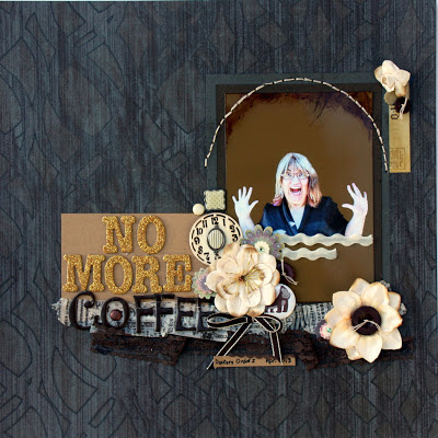
I started out finally finishing my No More Coffee layout. I have not quite got it down to zero but I'm down to one cup in the am with an occasional cup of tea in the afternoon. So, better. No More works well with the glitter letters, third try a charm.

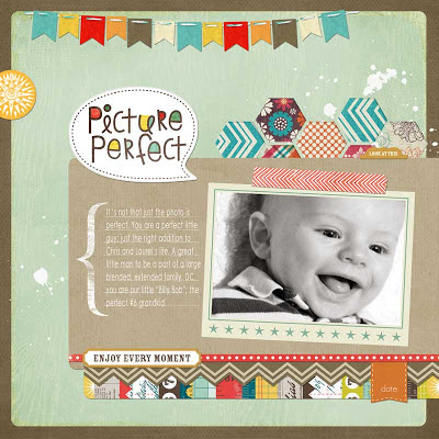
I'm still working on learning digi. I know a few things but am reviewing the basics with Jessica Sprague classes and am learning a few tricks to make things easier and faster. Not that it is fast to learn digi; but, I am getting there! Here is a quick page with a Photoshop edited photo and a little more practice with brushes and leading on my type.DC is a sweet guy to scrap about!


Just a few paper layouts. I loved the photo of the flowers. I saw the light as soon as Meghan mentioned it but I need to train my eye to see it more readily on my own. Since one of Joe's favorite sushi rolls is Rock and Roll the photos on the table were perfect with this line of paper. Now why would I scrap terrible phone photos of service station rest rooms? Well, because there was a story to tell, of course! Last, but not least, Club Scrap made the line of lighthouse papers and that was perfect for the photos I had from Nova Scotia from a couple of years ago.


An eclectic assortment of pages that were fun to do. I hope to do a lot of scrapbook pages this summer. We'll see. These all came together quickly, which made it a lot of fun!

Friday, June 14, 2013

My on-line art class

 I have taken a number of on-line art classes in the past and enjoyed them a lot. When Coursera offered an art class, I was right there. Of course, 30,000 other folk are, too. I've been out of town and busy so I am just barely keeping up with the class. There are 5 assignments, only two of which are required. I am planning to do all of them though and I'm not sure about submitting any of them for a grade. I hate the pressure of getting it done by "x" time. So, I have decided to post my projects here on my blog and welcome feed back. No rude remarks please. Constructive comments are what I'd like.
This first project is a self portrait college done in a fantastical art style.

Self Portrait - a Fishbowl


Artist's Statement

This work is a collage of both found images and created pieces. Items were cut with a craft knife or scissors and assembled on Strathmore Multi Media paper with Golden matte gel medium. The green damask wall paper was a scrapbook paper from DCWV's The Luxury Stack which did not handle the gel medium well. I considered this carefully and decided to proceed since older wallpaper is often found on walls peeling and with imperfections. I believe that placing a hole in the paper to lay the blue-green cardstock below for depth added to my difficulties with the paper. The floor uses a frottage technique with Conte crayon on grey cardstock. The fish images are PS manipulations of a Clown-fishI used them with a seascape created with cut patterned green tissue paper. The easel is from an internet ad for the Lyre Easel Adjustable B 174-1 The painting is a photo transfer black and white cropped copy of a painting I've done in the past. I used an inkjet image for a dreamier quality than a laser print and did the transfer with the gel medium on Claudine Hellmuth's sticky back canvas. Diana is a PS manipulated image of the Louvre statue and the shelf is from an internet ad for a shelf on E-Bay, also PS treated. The table and tablescape are from an internet ad for a writing desk at Overstock.com. The scissors are from an article in Creating Keepsakes magazine and the yarn and needles are from magazine ads for Manos Del Uruguay yarns, the Olympus camera T-2 and from an article in Vogue Knitting magazine. The scrapbook albums and camera are from magazine ads for Pioneer Photo Albums and Michaels Stores. The sword of Asclepiades is drawn in AI and free hand. These photo realistic objects with the not perfect perspective and a variety of mismatched shadows enhance the dream-like quality of this art piece. The color scheme is red, red-orange, orange, yellow-orange, yellow, yellow-green, green and blue-green with neutral white, black and grey. By not using the violet tones the work has a warmer more inviting look. The neutrals add a more dream-like quality to the work. This is a glimpse into my life right now. I feel self-portraits elicit a bit of a voyeuristic quality; so, I used the fish swimming by the window, as if the room is in a fishbowl. The contents of the room reflect many things about me. I perceive Artemis to symbolically be my dominant goddess so she is looking over the scene as the statue on the wall. Art is and important part of my life as is my computer, scrap-booking, needle arts, reading and photography. The sword has a female symbol as a handle and is broken because my disability has prevented me from moving forward in my career as an OB-GYN physician. The Fiskars scissors are there to represent my on-line communities; the first I participated in was Fiskateers. The scrapbook and photo albums represent more than my hobby they also represent my family and friends and my memories. The significance of items on the floor only reflects my somewhat-messy self.                                                                   I believe I was successful in getting my audience to feel they are looking in on my life. I believe this represents a lot of where I am right now. While this was created as a specific assignment, I found this fantastical approach to be one that let me organize and synthesize my thoughts about not just my life but the process of art and its place in my life. I hope the viewer is intrigued and finds reason to linger over the image and consider the person who lives here; maybe,even to reflect on what kind of room they would construct to represent themselves.

Note: PS is Adobe Photoshop CS6 and AI is Adobe Illustrator CS6

Thoughts on Patient Canadians

Trees, so many trees. No, I'm not talking about the Canadian landscape. I'm reflecting on telephone trees. Canadians have adopted them full force with rarely an option for "representative". In the US, (as a Canadian would say "In the States") our telephone trees are often briefer than a few years ago and the option for a real live person, when you need one, is a pretty prompt choice with some companies. Not so, for Canada. When you do have a problem that can only be solved by direct communication you must wade through several trees to get there. The trees are long and convoluted complete with every disclaimer you can imagine. The staff cannot give you personal answers either, even after they have answered your specific request. For example, I needed to speak with a person about changing my mother's address since I am her power of attorney and have the authority to do this but I cannot just go to the website and do so and there is no local office here in Sacramento to drop by. The person I was finally able to reach gave me all the details about getting each page of the document certified as original and what I needed to send in but when it came to giving me the address of where to send all this info she sent me to a recording that gave the info. It was a very brief address.
I really am more American than Canadian because I do NOT have much patience with these. I am dealing with a lot as I settle my Mom into nursing home care. Very complicated and so many places to deal with and they all have telephone trees. Sigh! Since Canadians are patient and generally very polite. (four way stops can be a nightmare -You go first, no you, no you, please - Sigh again!), I do not see these going away or getting any shorter anytime soon, there will not be an outcry.
Oh, Canada!

Saturday, June 1, 2013

Poor neglected blog


 Susan won the BPC certificate and Cindy the Scrapbook.com one. Your loyalty despite my going a bit AWOL last month was rewarded!
LOAD and my class work took a lot of time. I just did not have time to get creative on my blog.
I'm going to put some of my pages here to show you what I was working on. I got more into digi, shadows and everything. I, also, used Keynote on my iPad to create a couple of basic pages. I need to figure out more about that program. I'm thinking it can work a little like a Smash Book or Project Life in some situations.
Some of my new found digi skills:


The larger photos are the LO's I built from scratch following directions in Debbie Hodge's Get It Scrapped, Scrapbook Coach class. The others are modified quick pages or templates.
Here's an example of using Keynote: 

Yes, I did not finish all 31 LO's but I did complete 25. 
Some of my paper projects:


 You will notice an obsession with food this month. Must have something to do with my going on the medically managed weight loss program at Kaiser. It's not going to be easy. It's pretty boring and Cal's diet is worse than ever - he eats so many tempting "wrong" foods and I cannot even begin to suggest that weight gain might have something to do with his worsening arthritis.
I'm leaving him home while I head for Canada for a few days, soon. I will really be upset to not be able to eat a coffee crisp. Oh, well. I have to keep my improved health in mind.
The hot weather has come to Sacramento, I know it may not stay until July but I am looking forward to enjoying the pool!


My continuing dating saga

 This morning, I criticized a supposed professional for lousy spelling when replying to a brief text message on a dating site. If grammatica...